Characteristic features
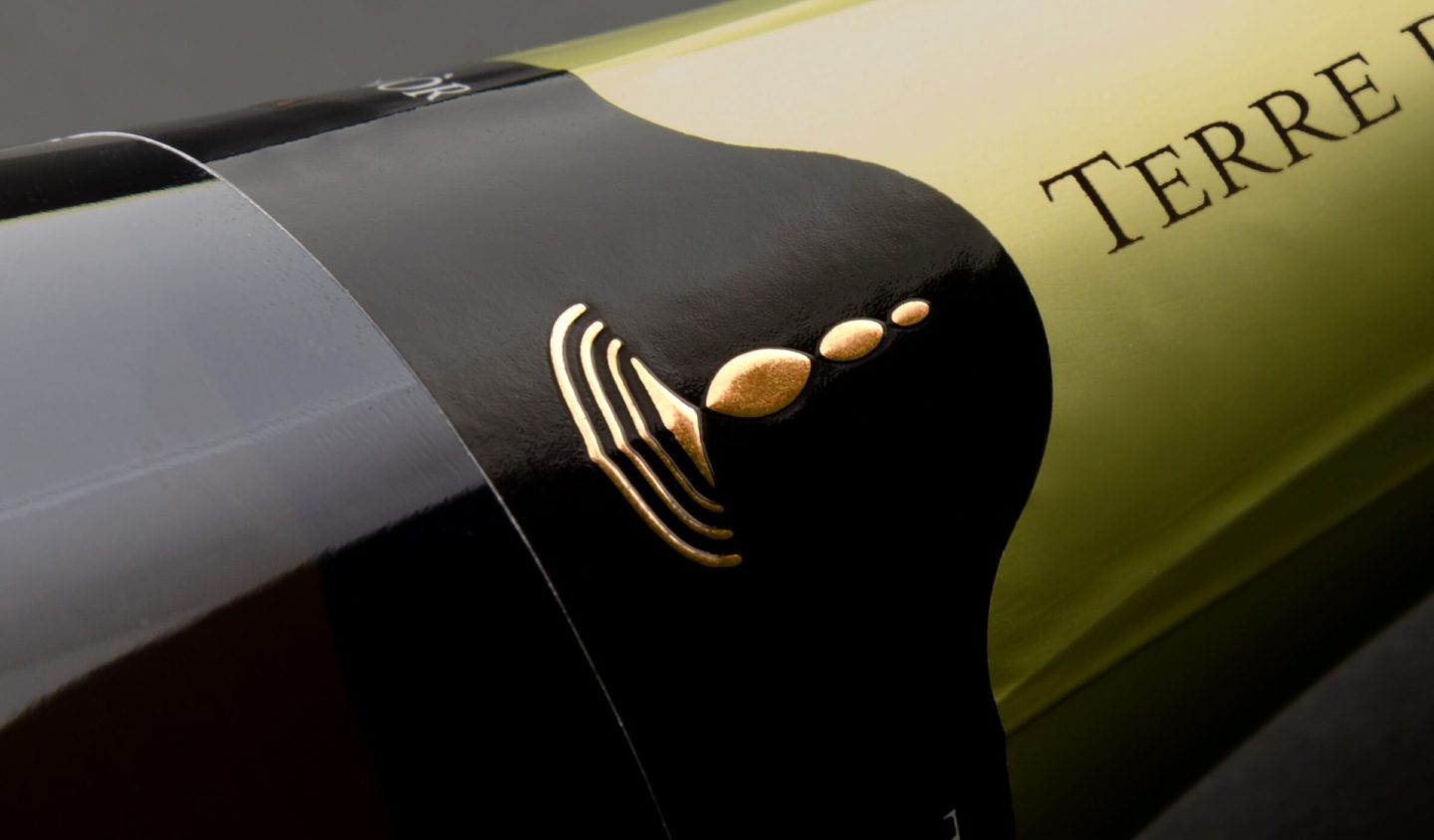
Symbols have the rare gift of provoking interpretation and evoking memories and imagery, through simple lines and shapes. Some of them can even foreshadow the future. In the lines of Terre d’Aenòr’s logo we can already glimpse our growth and evolution.
Our logo declares our personality, ambition and of course, Franciacorta itself. Cultural and artistic references are easily discernible, as well as our commitment to pursuing a noble objective. In its innermost essence, our brand has been created to leave its mark as an emblem, a visible trace and a living testament.
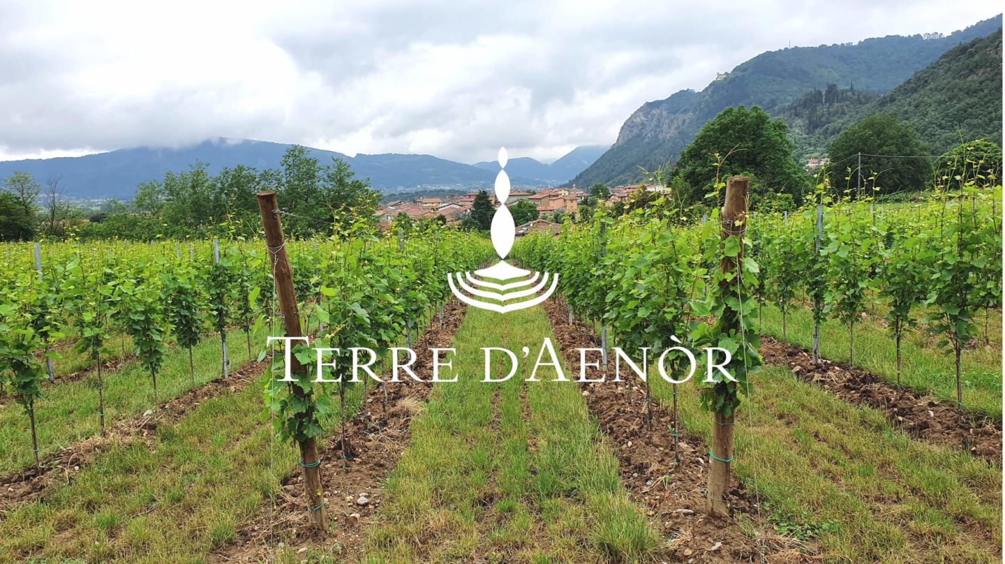
Terre d’Aenòr’s logo offers a layered interpretation. It’s made up of two movements. At the bottom a series of parallel lines form concentric circles making reference to its liquid essence. In the center three vertical elements are arranged in an ascending motion, alluding to the effervescence of Franciacorta sparkling wine. The logo viewed in its entirety recalls a stylized figure of the Mother Goddess, the goddess of antiquity who represents soil fertility.
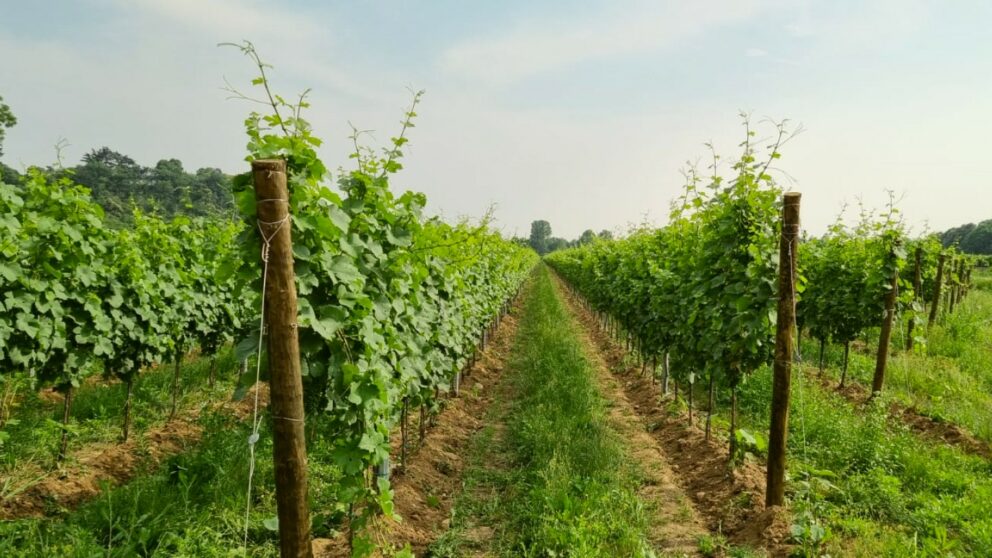
The three vertical elements can also be interpreted as a representation of Eleonora, Rosella and Amedeo, the founders of Terre d’Aenòr. The concentric circles resemble the rows in the vineyard, the natural element Terre d’Aenòr wants to enhance to the fullest.
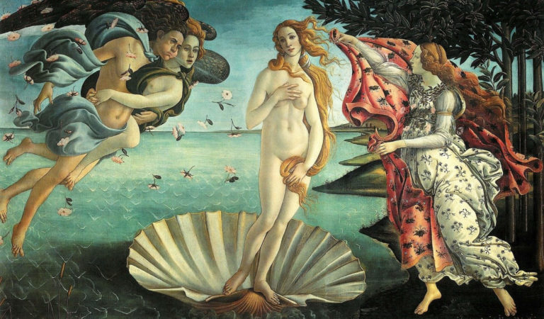
Lastly, we have the artistic references. The Mother Goddess emerging from the waves of the sea like in The Birth of Venus by Sandro Botticelli, a Renaissance painting of Venus, an icon of prosperity and beauty. The erectness of our logo evokes the Pyramids of Zone, large rock pillar formations created by erosion. This symbol of elevation and perfect balance can also be found in The Endless Column by the sculptor Constantin Brâncuși.
Territory, art and culture. Our brand encloses and conveys these expressive forms.

Terre d’Aenòr’s logo produces an ascending motion that stands for our commitment, devotion and desire to reach the highest quality of wine.


